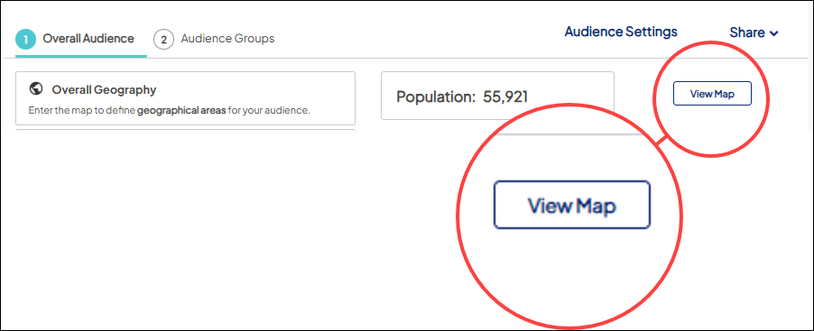
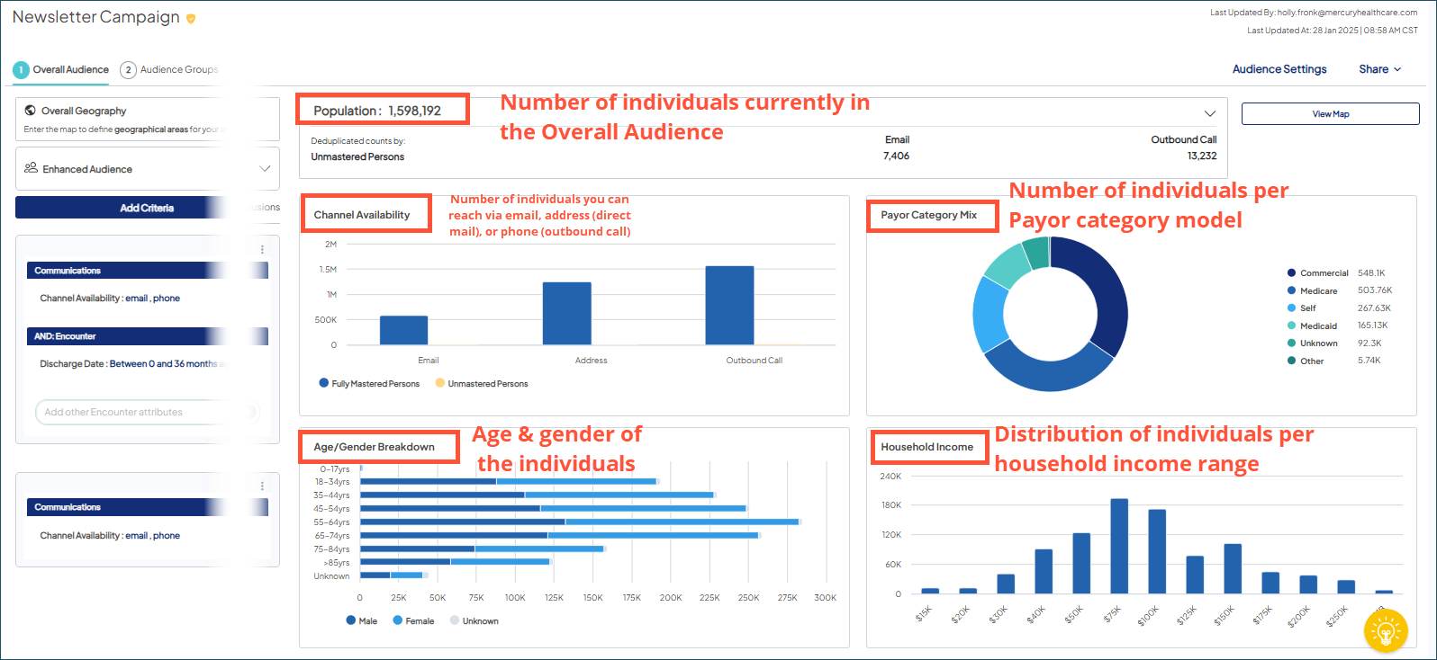
Evaluate your Overall Audience
Use metrics and map views to evaluate the scope of your currently selected overall audience. Both the metrics and the map views actively update as you add and save criterion at the overall audience level in Audience Insights Editor.
By default, the metrics for the overall audience display when you open a target audience. Choose View Map to open the map in order to use the map view options.
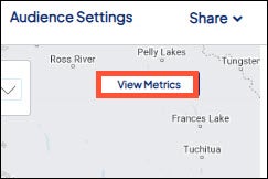
From the map, choose View Metrics to return to the metrics.
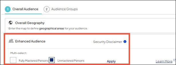
Enhanced Audience
In the Enhanced Audience section, you can select which audience person type you would like to include. Check the box for the appropriate person type. Learn more about Mastered and Unmastered records.
Metrics
Map
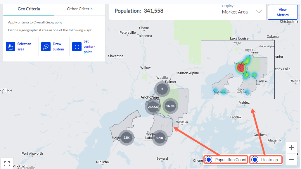
Offers two different methods for visualizing the population density of your current overall audience: Population Count and Heatmap.
By default, the Population Count view is the selected view when you open the map. Use the options in the lower right hand corner of the map to switch between the default Population Count view and the Heatmap view.
Population Count
This view reflects population density using ‘bubbles’ that display the number of individuals who reside in the bubble’s geographic location.
As you zoom in (or out) on the map, the total number of bubbles, their geographic location, and their population count change to reflect the population density as the geographic region on which you are focused changes. Although the size of the bubbles do not change to reflect population size, the advantage of the Population Count view is a more precise understanding of the population density through the counts they display.
Heatmap
This view uses a spectrum of colors to indicate population density across a geographic region. The color spectrum ranges from warm (red) for the areas of highest population density to cool (blue) for areas of lowest population density.
As you zoom in (or out) on the map, the color spectrum dynamically shifts in shape and size over the map to reflect the relative population density as the geographic region on which you are focused changes.
While the Heatmap view doesn't show population counts, the dynamically shifting color spectrum provides visual insight into the population hot spots of a geographic region.