Service Line Assessment > Market Insights overview
Market Insights
This tab is the best place to start analyzing where opportunities exist, because it provides insights helping you find and prioritize those key service lines. Compare year-over-year trends, the value of growing a service line, and average financial value per visit across service lines. Use the in-line filters to further narrow your results. Need a reminder on how the filters are applied? Check out the Market Planner Insights overview article.
Internal Status
This tab captures the internal health of your organization.
Multi-Factor Analysis dashlet
This bubble chart provides critical insights like which service line would have the most financial impact if it grew by 1% in the next year, or which service lines have been losing volume so you can adjust your marketing efforts. Hover over any bubble for additional details.
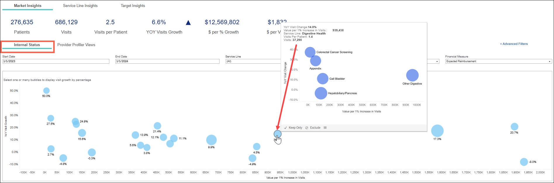
- X axis = value per 1% increase in visits
- Service lines furthest to the right have the largest value per 1% increase in visits.
- Y axis = year over year visit growth
- Service lines furthest to the top of the chart have the most year over year growth.
- Size of bubble = average visits per patient
- The larger the bubble, the more average visits per patient.
Ways to use the Multi Factor Analysis dashlet:
Which service line would have the most positive financial impact if I grew it by 1%?
Find the bubble furthest over to the right on the chart for the largest growth opportunity.
Which service line(s) have been losing volume and let’s explore that.
Find the bubble furthest to the bottom of the chart. Look for negative growth volume. Here you can find those service lines that you may consider a new campaign to run while also considering their financial value.
Scenario:
Let’s say I’m a service line manager and I need to focus on my specific service line –I find my service line in the drop-down filter and drill to explore the sub-service lines. Looking at Digestive Health, I see it's growing, profitable, and has a low number of average visits. I understand I don’t need a lot of these people to come in to increase revenue in this service line. I then hover over the bubble in the chart to see the breakdown by sub-service lines. This will show me the sub- service lines where the visits are taking place.
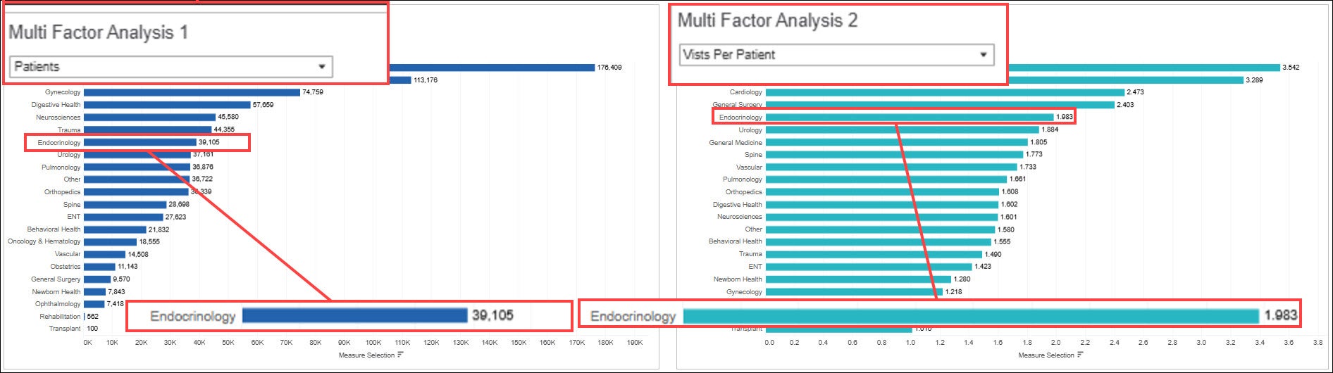
Multi Factor Analysis 1 & 2
This graph puts you in the driver’s seat and allows you to compare two factors at the service line level side by side using the drop down options. In Multi Factor Analysis 1 choose a factor to compare. Select another factor from the Multi Factor Analysis 2 drop down. View the bar graphs in the chart to compare numbers. Keep in mind the financials seen in this chart are a reflection of what you have selected in the in-line filters.
Analysis Factors
- Patients
- Avg $ per patient
- Value per 1% Increase in Patients
- YOY% Change in Patients
- Visits
- Avg $ per visit
- Value per 1% Increase in Visits
- YOY% Change in Visits
- Visits per patient
- Total $
Scenario:
The image below displays a comparison of how many patients had visits in the Endocrinology service line with how many visits per patient. There were 39,105 patients who had visits in the timeframe selected in the in-line filters, and each patient had 1.983 visits.
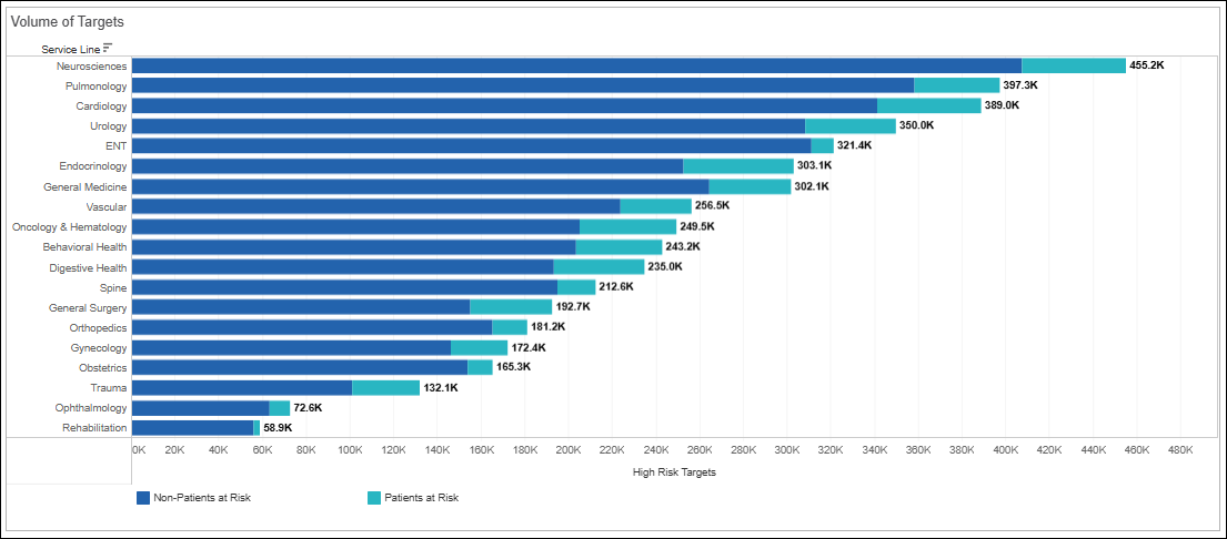
Volume of Targets
Look across our predictive models comparing opportunity between patients and non-patients at a service line level, looking at those highest at risk . You can use this dashlet to determine if its easier to get patients in that you already have a relationship with, or is it an option to look at the opportunity to grow new patient volume.
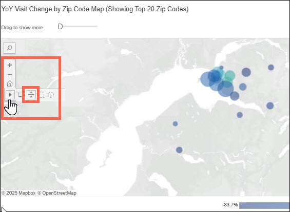
YOY Visit Changes by ZIP code (Showing Top 20 ZIP codes)
In this chart you can view which areas are growing and losing volume. You can drag the slider to see additional zip codes. This information can direct you where to focus your next marketing move.
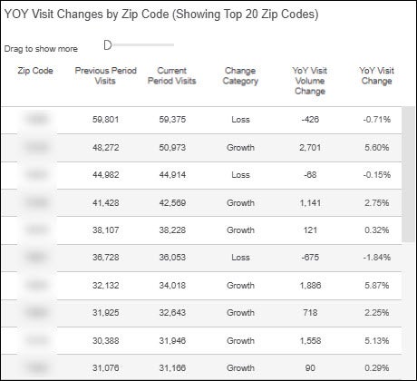
Change Category definitions:
New ZIP: Last year, no visits by individuals in this ZIP code and this year, there have been visits
Lost ZIP: Last year, there were visits by individuals in the ZIP code and this year, there have been no visits
Loss: Visits decreased this year compared with last year but there has been at least 1 visit
Growth: Visits increased this year compared with last year
No Data: Inconclusive or missing visit data for one or both years
YoY Visit Change by ZIP Code Map (Showing Top 20 ZIP codes)
This map dashlet is a Visual representation of YOY visit change as shown in the columns above. The circles represent visits in that area. The larger the bubble, the more the visits. To move around the map, you will select the the pan function. You can drag the slider to show additional zip codes on the map.