Once a report reaches Success status, click the report name to open the dashboard.
- Choose Your Viewing Angle
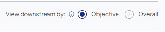
- You can toggle between two primary views at the top of the dashboard:
- Objective (Default): Shows data based on the specific Refine Objective settings (Service Lines, Facilities, etc.) of each individual campaign.
- Overall: Removes all Objective criteria to show every possible downstream interaction attributed to the campaigns.
- You can toggle between two primary views at the top of the dashboard:
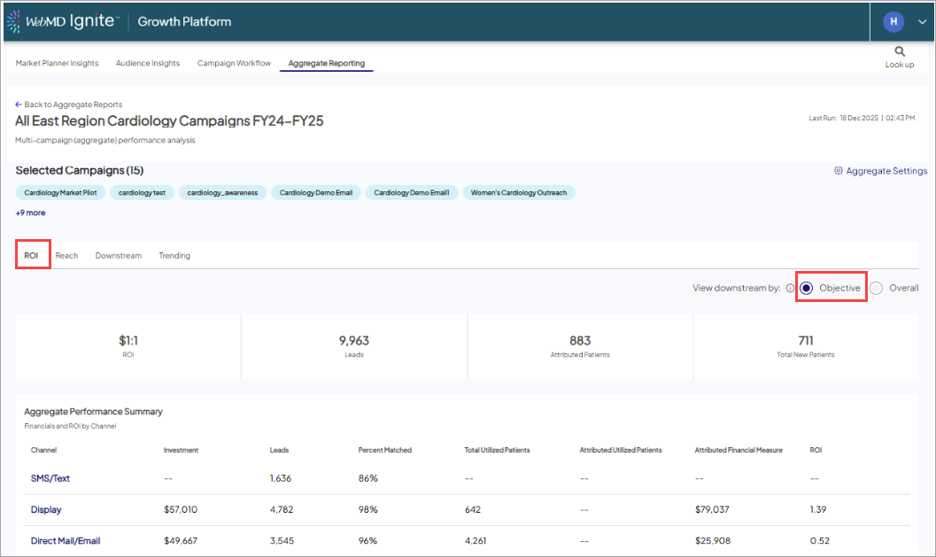
- Exploring the Data Tabs - the dashboard is organized into four key areas:
- ROI Tab: View high-level summaries including total Leads, Attributed Patients, and ROI by channel.
- Campaign-Level Impact Summary: Breakdown of performance across multiple campaigns within an aggregate group.
- Bolded top line displaying de-duplicated metrics rolled up from all campaigns in the report.
- Individual campaign rows: Subsequent rows showing a specific KPI snapshot for each individual campaign.
- Reach Tab: Analyze demographics, activity summaries, and lead trending.
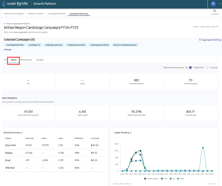
Included in the Reach tab:- Interactive map: Get a visual representation of your campaign's geographic reach.
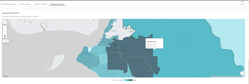
- Interactive map: Get a visual representation of your campaign's geographic reach.
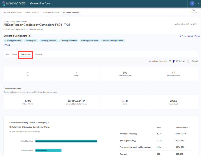
- Downstream Tab: Review service utilization, encounter types, and detailed financial performance.
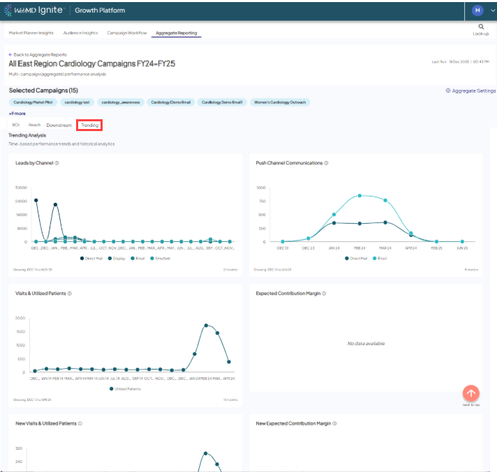
- Trending Tab: Track time-based performance trends for communications, visits, and revenue.
Tip: Because reports are static snapshots, you must manually click Run/Refresh from the list view to see the most recent data.