Reach tab
To see a comparison of the Reach tab when reporting includes only Mastered records and when Unmastered records are included, click here.
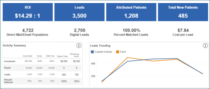
When you land on the Reach tab, you'll see your campaign's performance summary by channel. This counts any individual from push channels, as well as anyone who filled out a call to action for a digital channel.
- Sub-KPIs
- Direct Mail/Email Population: Number of distinct individuals who were communicated to through direct mail and email. This includes household members if household tracking is selected.
- Digital Leads: Consideration conversions (activities) captured from any digital channel attribution.
- Percent Matched Leads: Percent of total leads we were able to match back to a clinically mastered person record within Ignite Growth Platform.
- Cost Per Lead: Leads/Investment
- Activity Summary: Summary of activities broken out by channel
- Investment: Derived from the Cost Matrix
- Reach: Same as above
- Leads: Same as above
- Percent Matched: Same as above
- Cost Per Lead: Same as above
- Leads trending graph: Number for leads by month, broken out by the type of call to action. Hover over a point in the chart to see the breakdown of that number by channel.
- Form
- Custom Activity
- HRA
- Outbound Call
As you scroll down, the demographics of individuals who were communicated with and individuals who engaged with the marketing ad through digital channels is displayed.
PUSH channels: The Age, Payor, and Gender charts below currently do NOT display Reached categories until an individual who received the push channel message utilizes services. For example: if 10,000 were reached in the 18-24 age category but 0 visits have occurred for that group, neither bar will appear. When at least one individual in the 18-24 age category utilizes services, then the Reached 18-24 age category bar will appear in the graph.
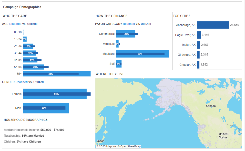
- Who they are
- Age: Distribution of age group of individuals touched by the campaign. The bar charts show an additional layer of information: The lighter blue bar represents your campaign audience (reached and engagements), while the darker blue bar represents patients who had a visit with your health system post-campaign contact. This allows you to compare how the utilized patients index over the reached audience for this campaign. The darker blue bars change values based on whether you are looking at the Objective or Overall view. Hover over the bars to see the percentages for each audience.
Note: The Age chart excludes individuals with Unknown age.
- How they finance
- Payor Category: Distribution of payor category of individuals touched by the campaign. The bars have the same functionality as Age. Payor Categories will exclude individuals we do not have data for.
- Commercial
- Medicaid
- Medicare
- Self
- Top cities: Volume of individuals touched by the campaign by city, restricted to the top 5 cities by volume. Top cities exclude individuals we do not have data for.
- Gender: Distribution of gender of individuals touched by the campaign. The bars have the same functionality as Age. Gender categories exclude individuals we do not have data for.
- Household demographics: Demographics of individuals touched by the campaign. This section looks at every individual reached. Marital status includes individuals we do not have a marital status for.
- Median Household Income
- Relationship
- Children
- Payor Category: Distribution of payor category of individuals touched by the campaign. The bars have the same functionality as Age. Payor Categories will exclude individuals we do not have data for.