Release notes: July 23, 2024
You asked, we answered: Reporting enhancements
This release brings 2 improvements to the campaign dashboards based on user feedback. Details below!
Custom service lines now available
What it is
Get reporting on services and/or sub-service lines defined by your health system, if applicable. These can be used in place of, or in addition to, Ignite Service Lines.
How it works
Any custom service/sub-service lines you select in Campaign Settings will then be selected in your campaign reporting filters for Service Category and/or Service Sub Category. The filter dropdowns now include custom services, using a CUST prefix, along with Ignite Service Lines, with a new IGP prefix.
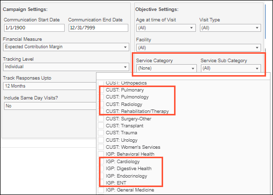
Why it matters
- We know your organization may have its own established service line mappings, so we want to support that in your platform reporting and workflows.
- Ignite Service Lines are still available to capture ancillary visits driven by your campaign—learn more about our methodology. You can also use them in combination with your custom service lines for more comprehensive coverage.
See downstream visits for all facilities
What it is
At the bottom of the Downstream Detail tab, we’ve added a new report called Downstream Visits by Facility, featuring all facilities with visits based on your selected campaign criteria.
How it works
Facilities are broken out by Visits, Utilized Patients, and the Financial Measure used, and listed in descending order, from most visits to least. There is no limit to the number of facilities that can be displayed—use the right scroll bar as needed to view all.
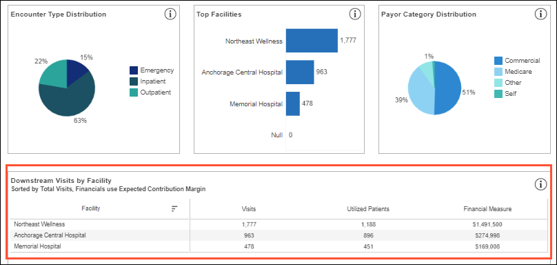
Why it matters
- The new report complements the existing Top Facilities bar chart report, giving you both an at-a-glance visual of your top 5 facilities and a detailed list view of all facilities.
- Now that all facilities are listed right in the dashboard, you don’t have to download a data extract to view them and their key downstream details. Leverage the extract for more granular insights; for example, a breakdown of facilities used by new vs. existing patients.
Fixed
- In the ROI Dashboard tab, now you can see the financial performance of your pull channel campaigns (Display, Paid Search, Social) as soon as there is at least 1 lead. Previously, there was a minimum threshold of 100 leads; now that only applies to campaigns with push channels (Direct Mail/Email), so there’s a large enough sample size for high-confidence ROI reporting