In this release: Campaign-Level Impact Summary report | Comprehensive PDF downloads | Interactive geographic map

Fresh off the launch of our Aggregate Reporting module, we’re building on the experience based on your feedback. This release brings key enhancements for deeper insights and easier sharing, helping you turn data into decisions.
Campaign-Level Impact Summary Report
Your barometer for individual campaign success
While rolling up results gives you the big picture, understanding which specific initiatives are moving the needle is just as vital. This enhancement provides a side-by-side look at how each campaign contributes to your overall aggregate performance.
What it is
Built from your direct requests, this new chart provides a snapshot of each campaign within an aggregate group. The distinct structure pairs your de-duplicated aggregate totals with campaign-level breakdowns for nine essential KPIs, including Investment, Leads, Attributed Patients, and ROI.
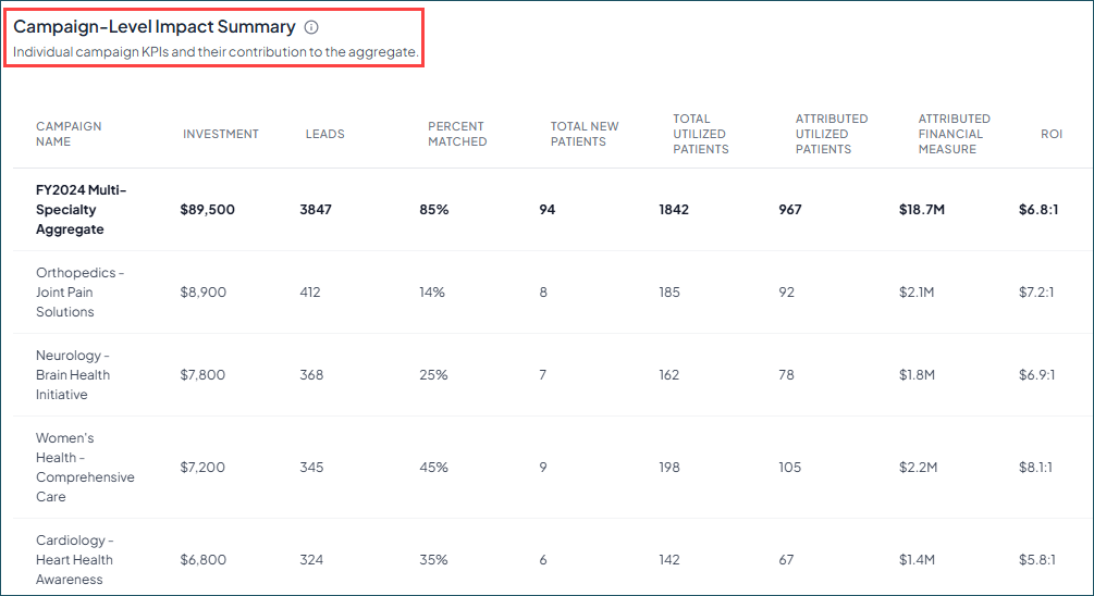
How it works
- Access the chart: Find it on the ROI tab in your Aggregate Reports. Note: Your previously created reports will need to be duplicated or recreated to see the new chart. It will not show up in previously run reports.
- See the true aggregate: The bolded top-line provides a de-duplicated view of your downstream data rather than a simple sum across all campaign metrics. This is where our methodology-backed Aggregate Report really shines and ensures your totals reflect unique individuals and true financial value, even when those individuals interacted with multiple campaigns.
- Compare performance: Use the individual rows to evaluate metrics — like ROI and Total New Patients — across all campaigns in the group.
Why it matters
By connecting the dots between aggregate results and individual campaign performance in a single view, you can:
- Gain granular visibility: Easily identify standout campaigns— like a specific "cardiac screening" initiative — by seeing exactly how much it contributed to your overall aggregate.
- Double down on what works: By viewing every campaign's KPI snapshot in one place, you can make faster, data-driven decisions on where to shift your budget.
- Simplify stakeholder reporting: Present a complete story of success, moving seamlessly from your total de-duplicated impact down to the specific campaigns that drove it.
Comprehensive PDF downloads
Executive-ready reports in seconds
You’ve done the work to drive results. Now, with a quick click in Aggregate Reporting, it’s easy to share your success with stakeholders.
What it is
This new functionality lets you export visuals and tables from the Aggregate Reporting module as a single, well-formatted file. Whether you need a snapshot of the current tab or a full report of the entire dashboard, your data is captured exactly as you’ve configured it in the platform.
How it works
- Select the Download icon: Find it at the top of any page within your Aggregate Report.
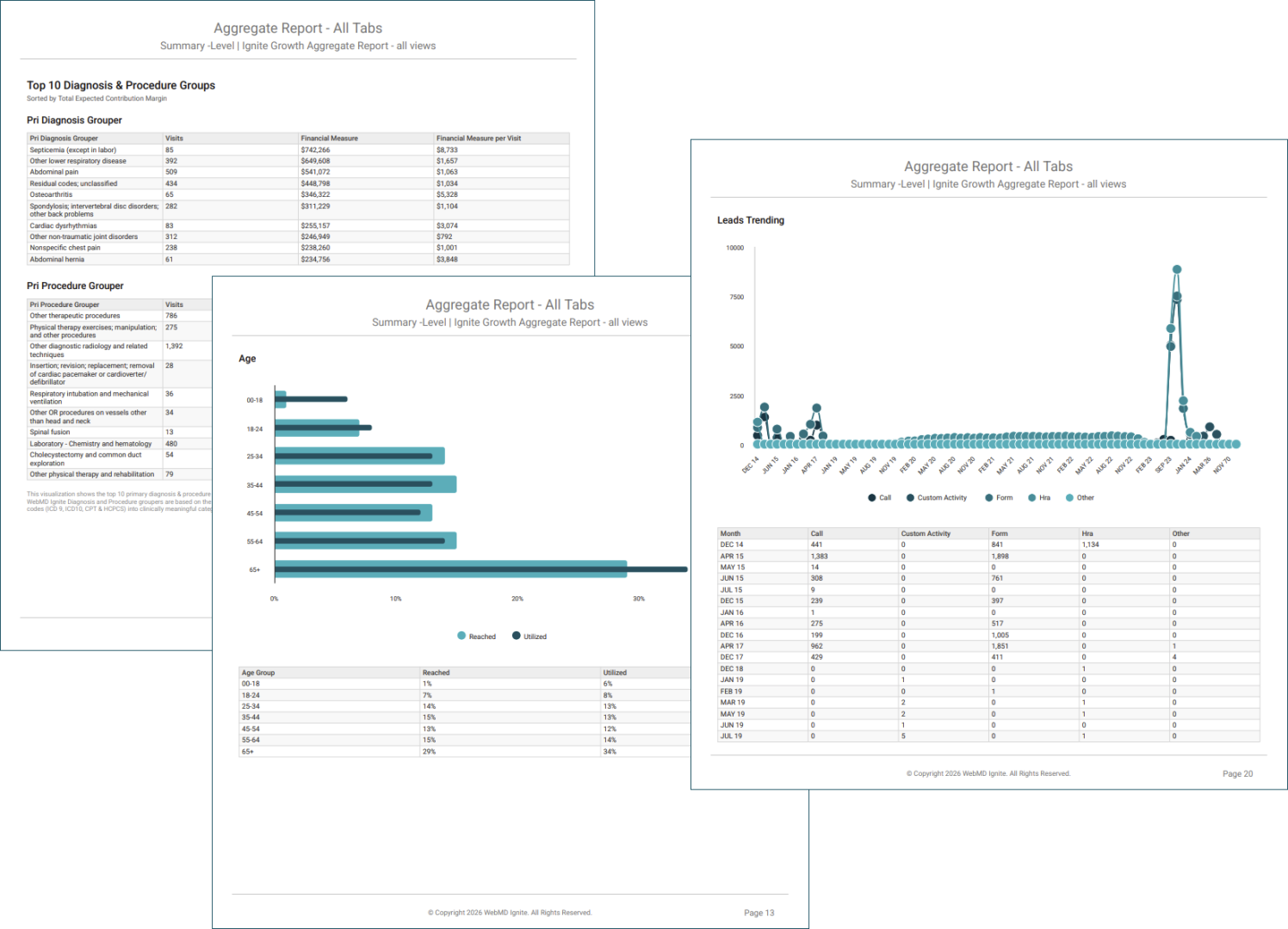
- Choose the report type: Download just the current tab, or bundle all four tabs (ROI, Reach, Downstream, and Trending) into one document.
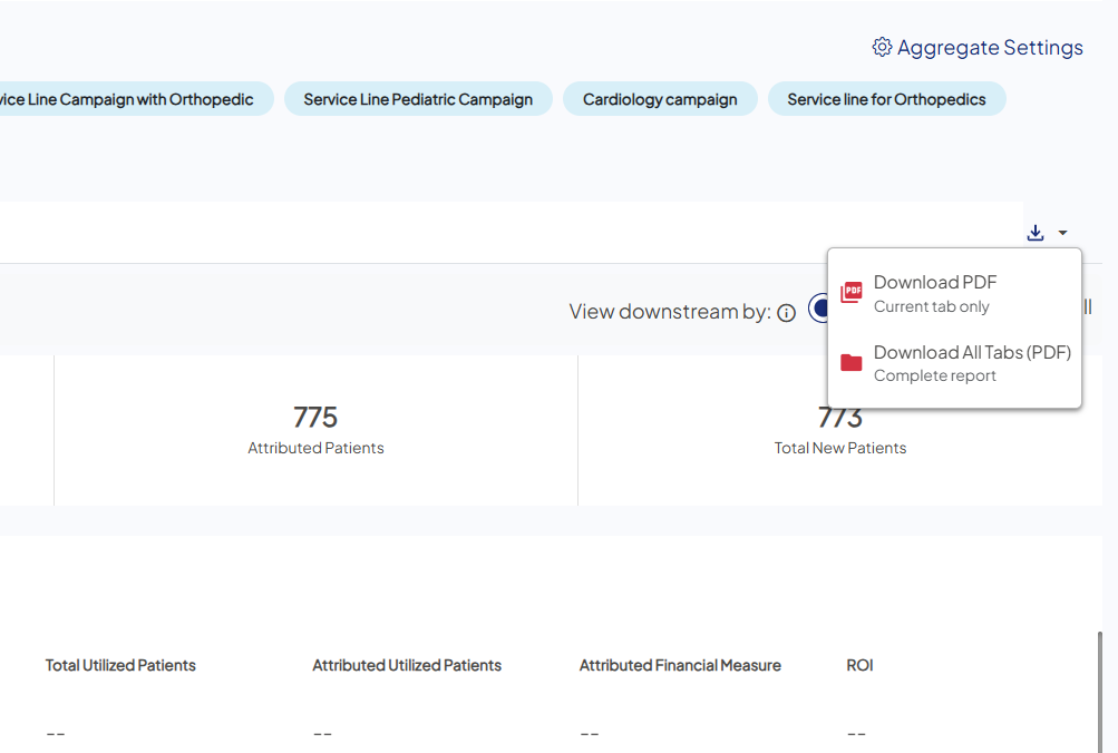
- Export and share: The platform generates a high-fidelity export of your charts and map views, complete with essential metadata — like the Report ID, date parameters, and campaign list — for a professional hand-off.
Why it matters
- Saves time and effort: Eliminates the need for manual screenshots or piecing together separate data exports.
- Preserves context: By capturing your exact map views and filtered KPIs, you can present the data precisely as you analyzed it.
- Presentation portability: Create summaries that are easy for anyone to interpret and without the need for platform access.
Interactive geographic map
Visualize audience distribution across your service areas
Now you can get a dynamic look at your reached campaign demographics. Similar to the surrounding charts, the map is an interactive way to visualize the major areas penetrated by your marketing push communications. 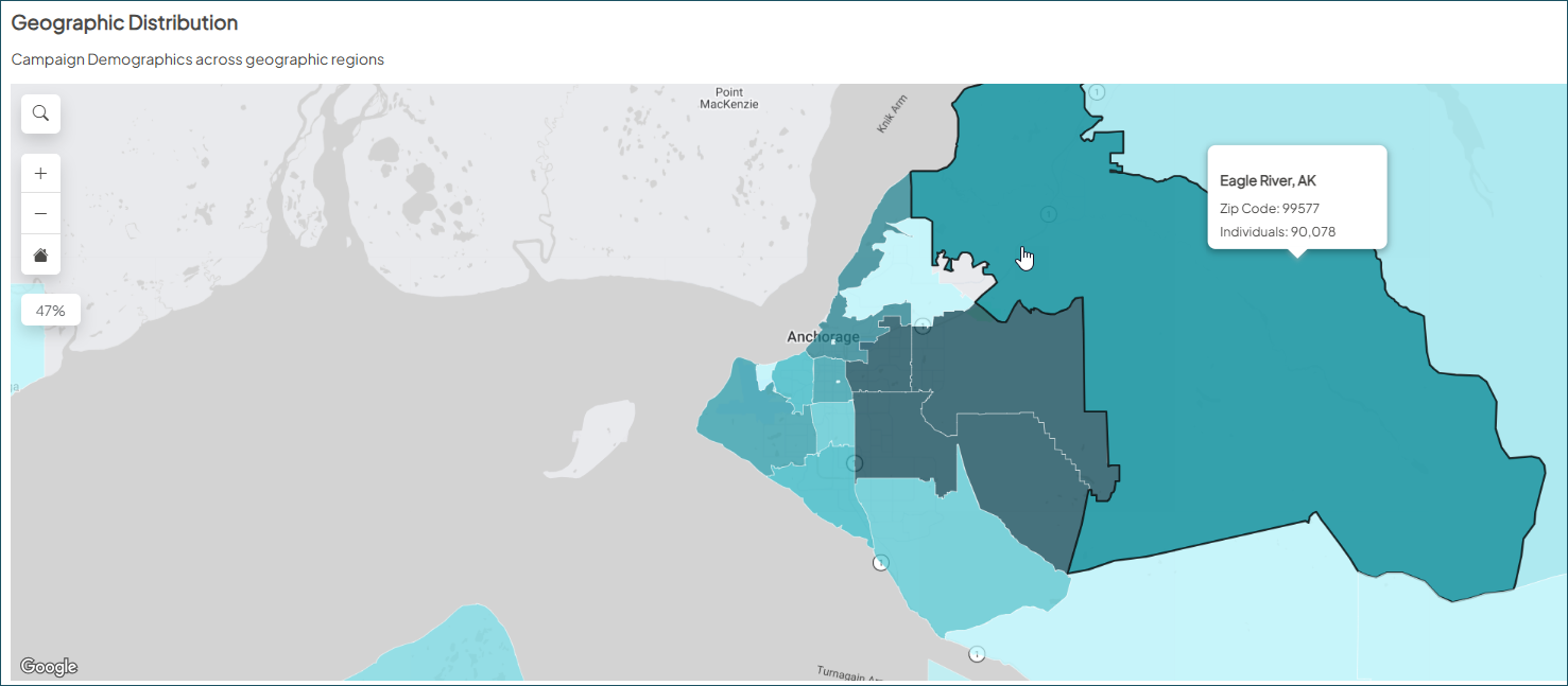
To access: Create a new Aggregate Report or duplicate an existing report, then navigate to the Reach tab, and scroll down.